
 Today, if you want to create a product that will become legendary, you have to spend a lot of time researching, validating your ideas, looking at other products, testing them, etc. Unfortunately, all these still won’t guarantee success. Even with such a large set of resources like the Internet, books, videos, etc. Besides, no one will accept your idea without deep research and market analysis.
It is a well-known fact that in the Soviet Union, all information was blocked from outside. But when outside information did manage to make its way into the country, it was collected bit by bit and passed from person to person carefully. This is how the products that I will talk about were built: almost in complete isolation from the rest of the world. Mostly with local knowledge and local resources.
Despite these limitations, engineers and designers have made wonderful devices that were used by most people in the Soviet Union. Not all of them are perfect from the UX side but there are plenty of amazing solutions and features that can inspire everyone.
TV Electronica VL-100

Image by u-ssr.ru
It was the first portable TV in the Soviet Union. Electronica VL-100 was extremely popular because of its unique design and compact size. Also, it was relatively lightweight — only 2.8kg! One of the best features of the TV was the portable battery, which you could add and take with you to the park. It was the right product for the right time. The engineering team filled in the need for a portable device. They didn’t just improve existing products but changed the way of how people use TVs.
TVs Electronica-50 and Electronica VL-100
The most prominent part of every new product is the ability to use with as least explanation as possible. This TV was very successful with that. Electronica VL-100 had 5 small dial knobs to control contrast, brightness, etc., plus one big dial to switch between channels. This simple control system allowed to set up and use the TV easily and intuitively. Every dial has its label and placed above it. When the user turns a knob, they can see what setting they are changing. Indeed, not all modern products follow this simple rule: give enough context to users.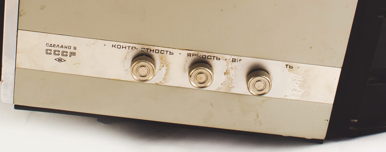
Setting knobs: Contrast, Brightness, Turn ON/OFF/Volume. Image by u-ssr.ru
Another remarkable part of the TV is the antenna that goes straight from the handle. It is a perfect solution that combines both usefulness and aesthetics. Instead of going a standard way and mounting it on top or at the back, engineers came up with the ideal solution and added it to the handle. With this design solution, the engineering team prevented the antenna’s damage during frequent transportation. Another design decision that was driven by functionality is the material that the body is made out off. The core idea of this product is to be portable and used for outside events or often moved within a house. Customers want to be sure that after an accidental hit, it will not fall apart. It was the good old days when the design was mainly driven by customers’ needs and not by marketers.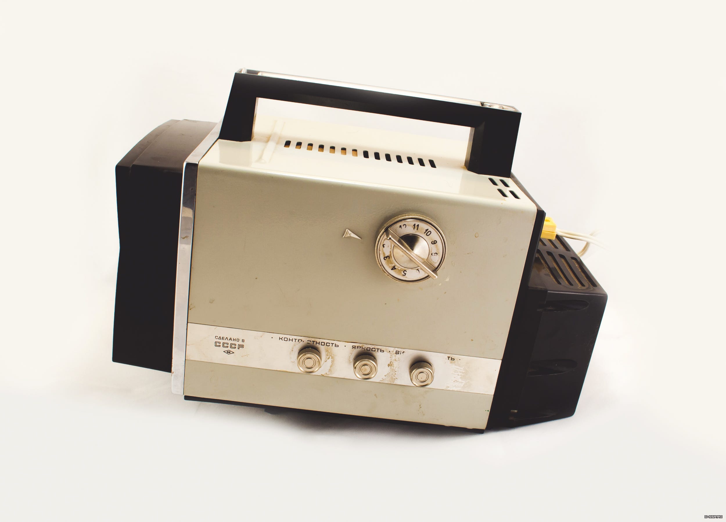
Side View of Electronica VL-100. Image by u-ssr.ru
There are many products from the Soviet Union that are known for durability, and this one is no exception. You may be surprised, but there are lots of places where you can get a used TV and it is still fully operating. The fully functional product that has been produced 50 years ago, how do you like that? Normally, until around the 1990s, most of the TVs were cathode-ray tube-based with a small ceramic heating element. It was essential to have some cooling to avoid overheating. Engineers made holes on top and at the back to be sure that inside parts won’t overheat. At that time, passive cooling was a standard choice for lots of TVs.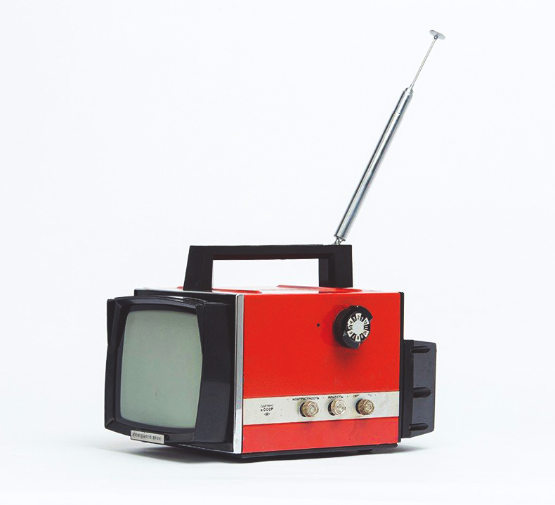
Electronica VL-100 red
The overall style is simple with a little number of details. I would even say it’s close to Braun type of products from a design perspective. The only thing that I find underwhelming is a huge logo on the front of the device. You do not want to tell your user the name of the device every time they use it. People will buy a great product one more time but not because of the name in the front.“Spidola” Radio
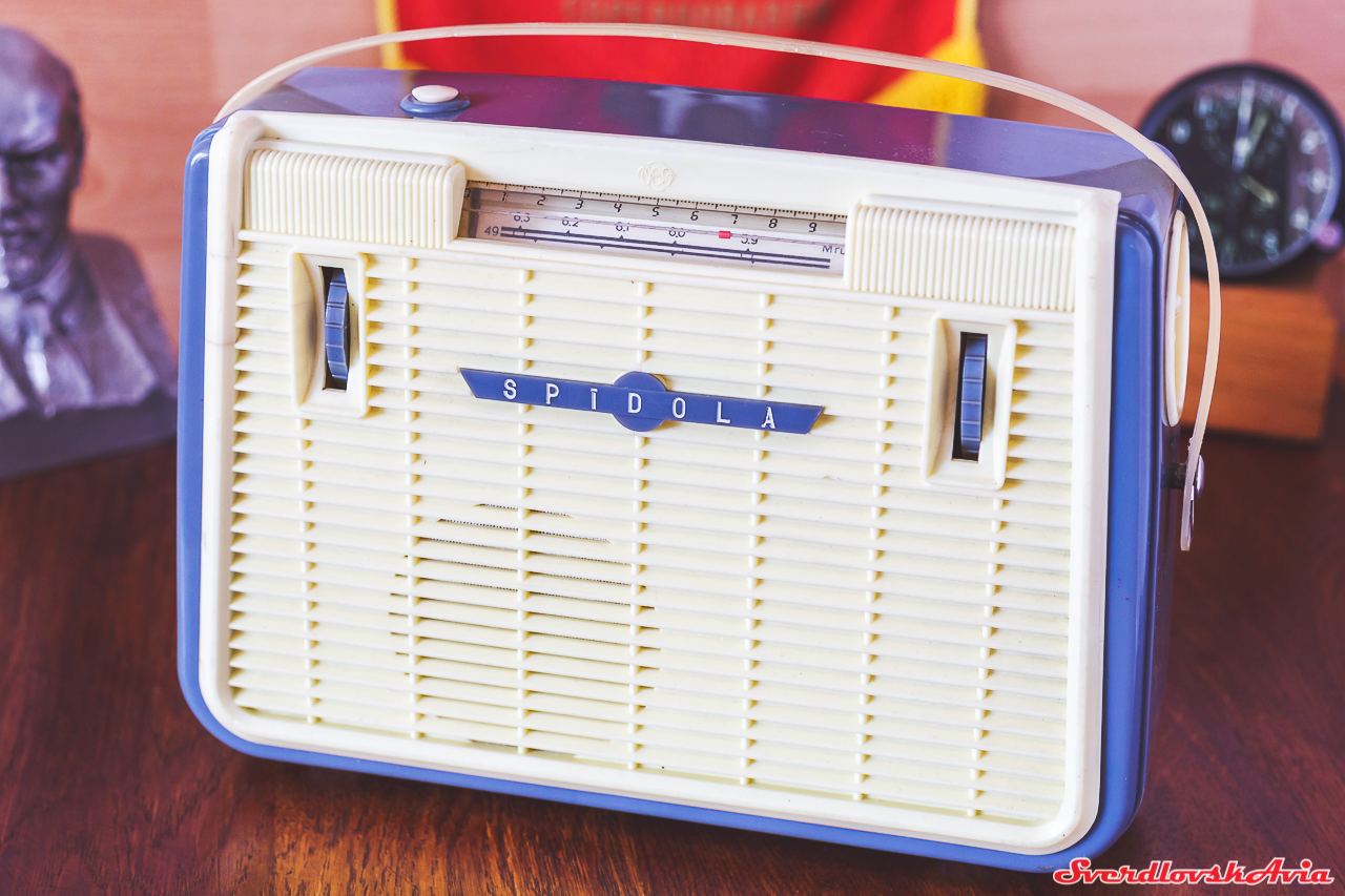
Beautiful “Spidola”. Image by SverdlovskAvia
Let’s continue our path to the world of portable devices. The next one is “Spidola” radio that has been produced in the early 1960s. This radio is one of the most popular devices in the USSR in the middle of the XX century. “Spidola” was a pioneer in the world of portable radios. Many people wanted to have a small and convenient radio for different occasions. In the 1960s, all radios were huge, heavy and just for home use. That’s why this radio was a breath of fresh air for people who wanted to listen to music outdoors or on the go. Technical characteristics were outstanding for that time — almost 200 hours of battery life without recharging. For the first product in this niche, it had impressive integration with other products. For instance, you could plug a bigger antenna or a more powerful speaker. Sometimes it seems that the ability to plug the third-party devices are not the most important function for the initial version but it set the standard for all future portable devices.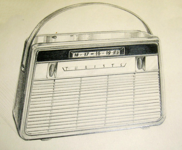
The first sketch of the “Spidola” radio
Sometimes even for the first version, you must have a killer feature to make sure that your product can compete with others on the market. Of course, for this radio, the main feature was portability and only then third party plugs. The design of “Spidola” Radio is minimalistic and clean. The metal body instead of plastic for better durability in conditions of frequent transfer. Engineering team could choose to make a plastic body, but they put endurance first. It’s not overloaded with ornaments or functions. This is a simple radio that does its job amazingly. The antenna also hides inside the radio, which is the ideal solution for portable devices to prevent any damages. The speaker is small relative to its body, but the quality of the audio is impressive for that time.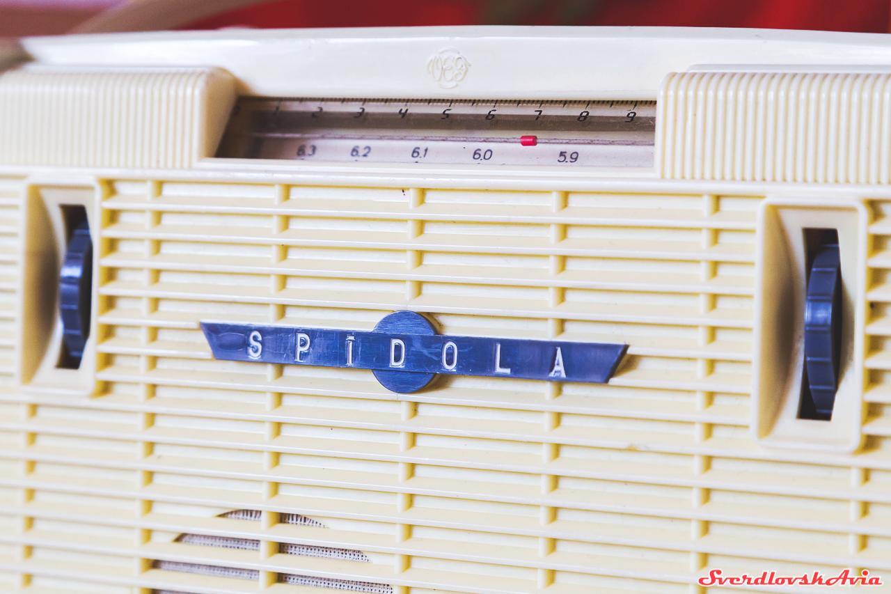
Image by SverdlovskAvia
Another detail — all controls of the radio except the handle are “hidden” inside the body. The handle is soft and thin to make the product lighter. All controls are missing labels, and that’s a problem from a user experience standpoint. If you wanted to know which control does what you had to check the operational manual. Interestingly, there was a lot of space to place labels for every button.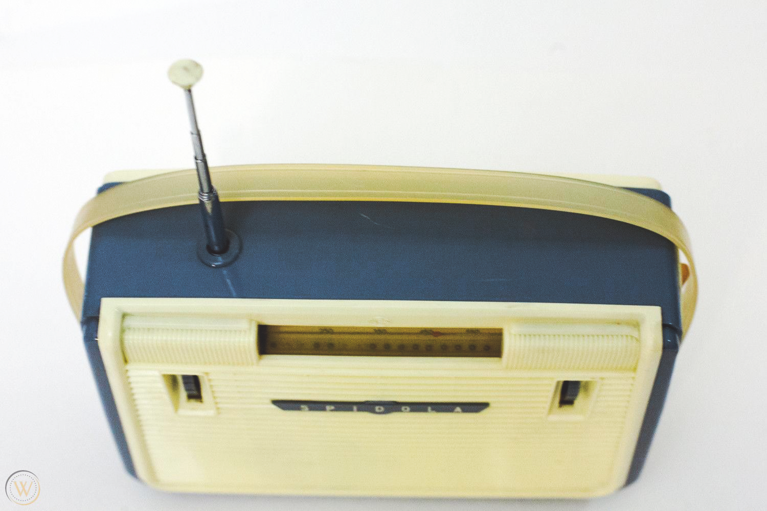
Image by worthpoint
“A user interface is like a joke. If you have to explain it, it’s not that good”. — Martin Leblanc.This radio was so successful that it served as the base for 5 different models of portable radios. All of them were released between the years of 1967 to 1978.
. . .
Both of these products had feedback forms that came with the packaging. At that time it was the only way manufacturers could communicate with customers. You should always seek for any kind of feedback, especially from direct consumers, to improve your product. Electronica VL-100 and “Spidola” radio are excellent examples of great functional and long-lasting design. Moreover, the durability that was laid in the design is outstanding. Hopefully, one day, everything will change and companies will be making products for people, not just for shareholders.. . .
Check out my other articles in the series: UX Inspiration from history: the Jerrycan UX Inspiration from history: the Minivan Taxi Originally posted on Taras' Medium page.The post UX inspiration from history: made in the Soviet Union appeared first on Marvel Blog.